Sunday, June 6, 2010

Level 1: Week 1: Lines, Shapes, Proportions

A big Drawing League welcome to our new SCMAC students! In the first 2-hour session we started seeing tremendous potential in the drawings produced! The first half of class we drew from observation. Then we created a large composition from the imagination by using ideas from the observational sketches. Our focus was on ways to hold the pencil, moving the whole arm while drawing, sketching light guidelines, and looking for accurate proportions. Scroll down to view your work. And be sure to click on your drawing to view it larger.


Pencil warm-ups by Helen (left) and Kirsten

Kirsten


Kirsten, this fantastic set of sketches shows quick progress in gaining control while holding your pencil on its side, especially the longer, sweeping curves of the toucan. Your sketches show fine examples of drawing on top of mistakes while sketching light guidelines for basic shapes; then you found accurate proportions (comparing the size of shapes to other shapes) by drawing darker outlines. The lizard's tail and toucan's head show your thinking process while searching for accurate proportions. A number of things make your large-format composition interesting, such as repeating lines, shapes and patterns as well as varying the sizes of animals. Varying the sizes of things also give depth to your composition. And the long angled lines in the background do a great job of breaking up the page.


Nice job of overlapping the frog's front legs and showing the lizard on top of the wood texture. Cool facial expressions!


Val


Excellent start in drawing with lines and shapes, Val!!! Nice sketching technique that you're developing in this set of drawings--confidently sketched guidelines and bolder strokes for final outlines. Overall, the proportions (sizes of shapes compared to other shapes) are very well drawn. Your accuracy and control of holding the pencil on its side improved with each new drawing. You pulled all the skills together in your drawing of the lizard! Excellent use of lighter and darker tones on the toucan. Really cool how you repeated the form of the frog in your large composition, showing rhythm and movement. Also, by lightening the tonal value of the frogs you're showing depth in the picture. The angle of the frogs divides the composition nicely.


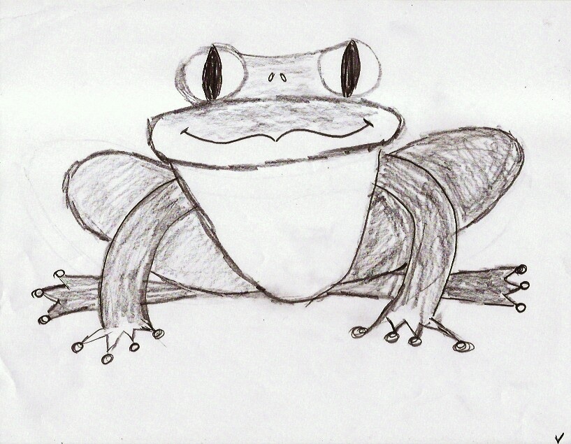
Nice job on overlapping the frog's front legs. :-)


Helen


Crisp line work and a keen eye for accurate proportions (sizes of shapes compared to other shapes) are a great start in developing your sketching style, Helen!!! Great job of adding all the details of the toucan and lizard such as the overlapping of the lizard's body on top of the wood and texture of its skin. The light guidelines and darker outlines of the toucan's head show accurate corrections in proportion. And the overlapping legs and position of the frog's feet give 3D depth to your sketch. Awesome mash-up going on in your large composition. Really like how you interlocked shapes t0 break up the page! Lighter and darker tones tie it all together nicely.


Nice job in improving the proportions of the puffer fish, especially its curved belly.

Level 2: Week 6: Color, Proportion

This group of intrepid sketchers continues to blaze new trails! The previous week found everyone immersed in tonal values of grays. And this week we plunged into mixing it up with Prismacolor pencils. We captured the fun evening in new photos and a new music vid.

Michele


Your drawings show a quick progression in learning to control the layering of colors. The blending of yellow, red, and blue comes together wonderfully for a smooth look in your final apple drawing--VERY cool illustration style, Michele!! Really like how you experimented with various color combos in your awesome impressionistic take on the squash! It's interesting to compare the techniques used for the squash and the apple. You're on the verge of busting open a looser style with energetic, sketchier line work as well as a tighter realistic approach. Go for it!


Penny


You REALLY got into the zone during this lesson, Penny!!! Layer after layer of colors gave way to the brilliant surface textures of the apples. And during your color-blending process you focused on showing realistic curved contours, especially in the areas where the stem is attached. The shadows cast by the stems and the highlight areas are really nice touches. Let's do more exploration in dramatic shading as your drawing style develops. Your skills have progressed beautifully! You're on to something here--grab your sketchbook and draw like the wind!


Matt


Put some Prismacolor pencils in your hands... and... watch out, man! You clicked into the blending process quickly, laid down your base colors, got into the rhythm, and never looked back. Awesome how you loosened your strokes to show a sketchier, more impressionistic style. Because you applied lots of layers, some very wild colors emerged in the mix. REALLY liking how you mashed up the apples and bananas in your composition! Hey, Matt, you've GOT to venture into doing more surrealistic compositions.

Allison


Beautiful! Drawing! Allison! You've gotta add Prismacolor pencils to your sketching tool kit at home. Your study sketches show a quick understanding of the form of the apples and how to blend the pencils. Your final drawing of the apple is wonderfully realistic--in color mixing as well as accurate proportions. The subtle shading and surface textures are nice touches. And your take on the squash broke it wide open for experimentation in a freer, looser style. Definitely beyond very unique. :-)


Saturday, May 29, 2010

Week 5: Tonal Values, Proportion, Study Sketches

As we began exploring tonal values we continued working on contour edges and proportions. Drawing the agave plant was initially challenging, but everyone used contour study sketches to get into the zone; then concentrated on depicting light and dark green leaves with gray tones. As the evening progressed, layer upon layer of shading and line work revealed exquisite compositions! Learning to draw on top of mistakes was a big breakthrough for all of you. Also, everyone got into wonderful detail work while using a kneaded eraser to show textures and highlights.

"From the optical viewpoint, we find that things are not defined by their symbolic names but rather through the action of light... [the eye] sees a collection of colored shapes revealed by the action of light." --Ted Seth Jacobs Drawing with an Open Mind

Drawing by Matt


Your knowledge of tonal values will be quite useful as we jump into learning to blend colored pencils. See you Thursday! --Rob

Allison


It took awhile for you to drop into the zone with this one. But then you focused your skills and pulled together a brilliant drawing, Allison! Your study sketches show looser, confident contour lines as you searched for the form of the plant and laid down accurate proportions for your finished value drawing. Excellent work in using gray tones to show the values of light and dark greens of the plant's leaves, especially where the highlighted edges of leaves meet the darker background shadows. Depicting these contrasting values is what brings dramatic depth to your composition. I'm really liking the subtle shading of the curved underside of the foreground leaf and where you used the kneaded eraser to lift highlights, blend tones, and add textures. Keep exploring ways to use expressive tones and lines to show your impression of things.

Matt


Your rapid study sketches evolved into a wonderful finished piece, Matt! The contour line studies show the continued emergence of your sketching style--fast, fluid, accurate. The final drawing shows your control of the pencil and eye for subtle tonal values. Great job of using contrasting values to show contours and depth in your composition. You did a superb job of drawing with the kneaded eraser to create very natural looking curved edges on the leaves, surface tonal gradations, and highlights--especially on the cone shape in the center of your composition. Awesome how you used delicate curved lines to show the contours and surface textures of the leaves.


Penny


This is a fantastic line-up of study sketches, Penny!! Your drawings are an excellent example of breaking free of focusing on what the plant looks like and getting absorbed in the sketching process. Your experiments in line work, using the whole page as a composition, and fluid drawing style is a delight to the eye. You then applied the same energy to your final drawing. The result is a vibrant, impressionistic exploration of lighter and darker tonal values. I really like how you layered lines and darker tones to show receding tones of leaves in the background. Nice job of using the kneaded eraser to lift out highlights and textures. Important to apply this spontaneous sketching style--long, broad strokes and energetic line work--to your sketchbook work. Try drawing trees and plants around your house.